Lettuce Meal Prep
Agency
Phase Space
Roles
- art direction
- identity design
- copywriting
Period
2017
Branding meals for serious fitness
Previous logo
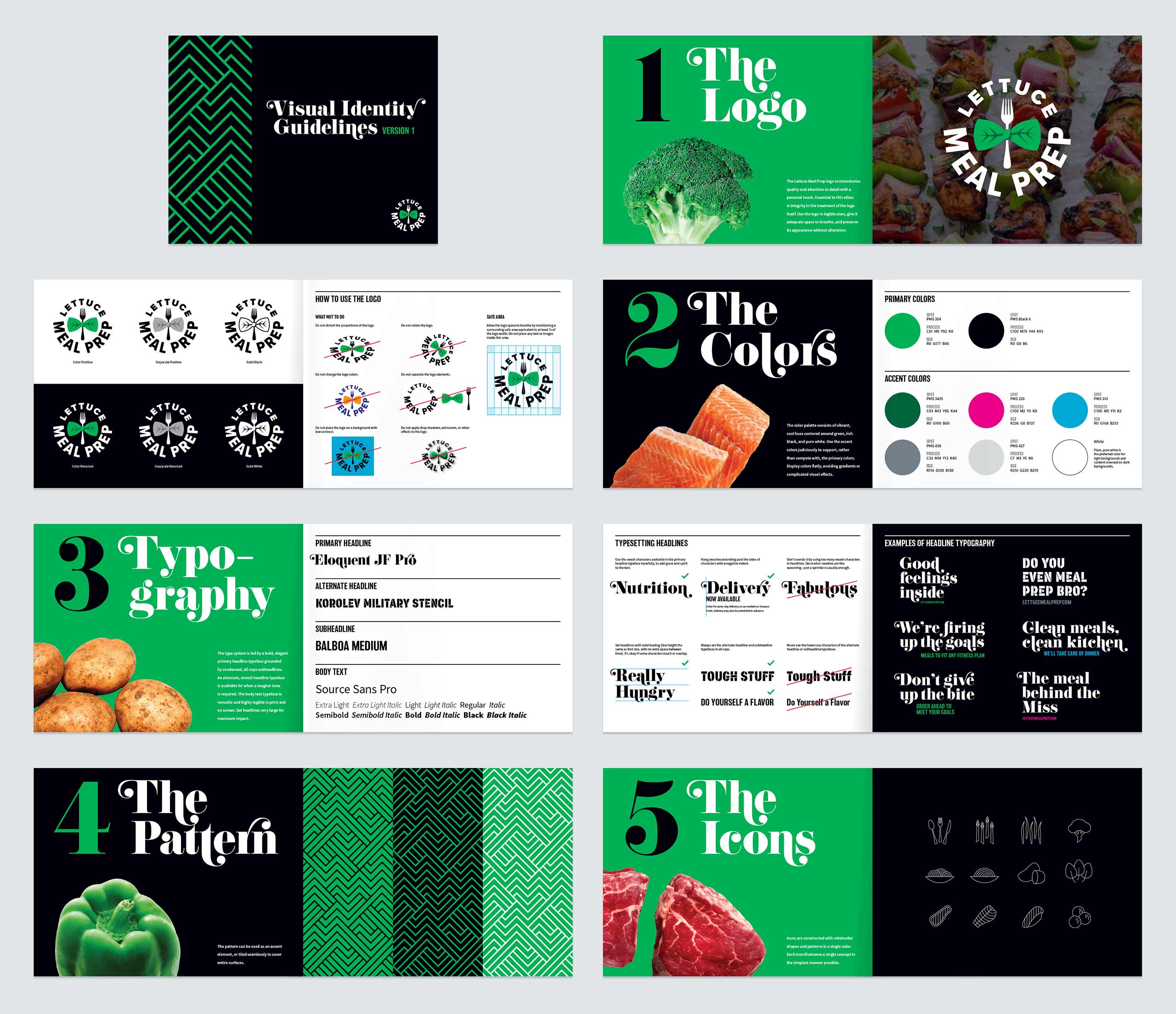
This Washington D.C.-area meal prep service began trading with a logo that was adequate, but rather staid and generic in tone. Lettuce Meal Prep’s product is high quality, certainly not the cheapest, and marketed mainly to young, affluent professionals and fitness niches such as pageant contestants and bodybuilders. As the business grew in exposure, they realized the need to completely rebrand with a logo and visual system that spoke specifically to these core markets.
The brief was guided by the following priorities:
- All branding would be targeted to young professionals who are both health conscious and visually sophisticated.
- The logo should clearly communicate the idea of meals of gourmet quality with a personal touch. We settled on a bowtie as being representative of this concept without being something that’s overused in culinary logos.
- The logo needed to be extensible to form subbrands for specific markets.
- A crossed knife and fork was to be avoided, because this is both a cliché and it happens to be a major element in the logo of a competitor.
- The aesthetic would be urban and cool, rather than rustic and earthy.
Fresh & fit for purpose
The bowtie in the primary logo solution doubles as lettuce leaves, wrapping a fork in crisp presentation. The brand is expressed in an attention-grabbing palette of cool, highly-saturated colors, rich black, and pure white.

Primary logo color variations
For niche subbranding the accent color is changed, an extra line of text is added, and the bowtie becomes a window for imagery that represents the theme.

Proposed subbrand logos
Versatility in simplicity
The typographical focus of the system simplifies the generation of branded materials. Primary headlines are set large and make heavy use of the swash characters available in the assertive but elegant Eloquent JF Pro. Korolev Military Stencil is available as an alternate headline typeface whenever a tougher tone is required. Subheads set in all-caps Balboa Medium provide a solid, no-nonsense foundation.

Mockups of proposed identity system applications
The identity toolkit includes a set of minimalist icons and a tiling pattern that represents layers of integrated ingredients.
Icons

Pattern in different color variants
Visual identity system guidelines